
When Smooth Motion Isn’t What You Want#
In the world of CSS animations, we are conditioned to seek smoothness. We use ease-in-out or cubic-bezier() to make elements
glide across the screen. But what happens when you don’t want a glide? What if you want a jump?
The steps() timing function allows you to break an animation into discrete intervals. Instead of interpolating values continuously,
the browser snaps the animated value from one state to another without rendering intermediate values.
While standard easing functions create continuous motion (where the element passes through every decimal point between 0 and 100),
steps() creates discrete motion. It removes the ‘in-between’ states, making it a functional bridge between CSS and traditional frame-by-frame animation.
In many cases, discrete motion communicates mechanical intent better than smooth motion — and that’s where steps() shines.
Syntax#
animation-timing-function: steps(<number-of-steps>, <jump-term>?);
<number-of-steps>: The number of equal-length intervals (steps) the animation will be divided into. This must be a positive integer.-
<jump-term>(Optional): Specifies where the instantaneous jump should occur within each interval. It defaults toend.jump-end(orend): The animation holds the current value until the end of the interval, then instantly jumps. This is the default.jump-start(orstart): The animation instantly jumps to the next value at the beginning of the interval.jump-none: Skips both the0%/startand100%/end, effectively removing one step.jump-both: Includes both the0%/startand100%/endmarks as steps, effectively adding one additional visible step.

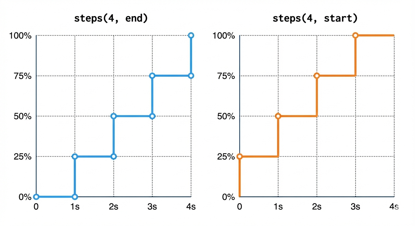
This diagram shows the “jump” occurring at the beginning of each interval for start and at the end of each interval for end.
Notice how start immediately reaches the first value, while end stays at the initial value for the first interval.
The Shorthand Keywords#
CSS provides two convenient keywords for the most common use cases:
step-start:Equivalent tosteps(1, start). The animation jumps to the end state immediately.step-end:Equivalent tosteps(1, end). The animation stays at the start state until the very end of the duration.
Mental Model: What steps() Actually Does#
To truly understand steps(), it helps to think in mathematical terms.
An animation timeline runs from 0 to 1 (or 0% to 100%).
When you write:
animation-timing-function: steps(5, end);
You are dividing that timeline into 5 equal intervals.
Instead of smoothly interpolating values across the entire timeline, the browser:
-
Breaks progress into equal chunks.
-
Rounds the current progress to the nearest allowed step (based on the jump term).
-
Instantly snaps to that computed value.
Conceptually:
steps(n, end)behaves similar to:floor(progress × n) / nsteps(n, start)behaves closer to:ceil(progress × n) / n
This rounding behavior is what removes all intermediate values and creates discrete motion.
No blending.
No sub-pixel in-betweens.
Only defined state jumps.
Choosing Your “Jump” Logic: Start vs. End#
Understanding the difference between start and end is often the biggest hurdle for developers.
| Mode | When step occurs | Mental Model | Common use case |
|---|---|---|---|
| steps(n, end) | At the end of each interval. | The first frame is seen immediately; the last frame is seen at 100%. | Typewriter, loaders |
| steps(n, start) | At the start of each interval. | The first frame is skipped; the second frame is seen immediately. | Sprite sheet animations |
Example Difference:
animation-timing-function: steps(5, start);
/* vs */
animation-timing-function: steps(5, end);
It’s important to understand that the browser isn’t ‘fast-forwarding’ through the animation; it simply stops rendering the intermediate frames.
If you animate a width from 0 to 100px in 4 steps, the browser only renders 0px, 25px, 50px, 75px, and 100px. The values 12.5px or 33px simply
never exist on the screen.
Pro Tip: If you are building a Typewriter Effect, you almost always want
end. This ensures the first letter isn’t skipped the moment the animation begins.
Modern Jump Terms: Precision Control#
While start and end are the industry standards, CSS now supports more granular “Jump Terms” to handle the common “missing frame” bugs:
jump-none: This ensures both the start (0%) and end (100%) values are visible for a full step duration. It effectively stretches the animation so no data is “lost” at the edges.jump-both: This includes a jump at both the 0% and 100% marks. If you have 5 steps, you will actually see 6 distinct states.
Note: Advanced jump terms like
jump-noneandjump-bothwere introduced in the CSS Images Module Level 4. While widely supported in modern browsers, ensure you check compatibility if targeting legacy environments.
Practical Implementation#
The Typewriter Effect: Using steps() with @keyframes#
One of the most common and compelling uses of steps() is creating a typewriter effect. The animation reveals one character at a
time, making a smooth, continuous reveal impossible.
1
2
3
4
5
6
7
8
9
10
11
12
13
14
15
16
17
18
19
20
21
22
23
24
25
26
27
28
29
30
31
32
33
34
35
36
37

<p class="typewriter">Hello, world! This is a typewriter effect.</p>

<style>
.typewriter {
  font-family: 'Courier New', monospace; /* Monospaced font for character consistency */
  width: 0; /* Starts hidden */
  white-space: nowrap; /* Prevents text from wrapping to the next line */
  overflow: hidden; /* Hides any text beyond the current width */
  border-right: 0.15em solid orange; /* Creates a blinking cursor */
  animation:
    typing 4s steps(42, end) forwards, /* 42 characters + spaces + punctuation */
    blink-caret 0.75s step-end infinite; /* Cursor blinking animation */
}

/* Keyframes for the typing animation */
@keyframes typing {
  from {
    width: 0; /* Start with zero width */
  }

  to {
    width: 100%; /* Expand to full width */
  }
}

/* Keyframes for the blinking cursor */
@keyframes blink-caret {
  from,
  to {
    border-color: transparent; /* Cursor invisible */
  }

  50% {
    border-color: orange; /* Cursor visible */
  }
}
</style>
Why steps(42, end)?
-
We count the total number of characters (including spaces and punctuation) in our phrase: “Hello, world! This is a typewriter effect.” which is 42 characters.
-
By setting
steps(42), thewidthproperty (which is animating from0to100%) will jump 42 times. Each jump will reveal approximately one character’s width. -
endensures that thewidthholds its current character until the very end of its allocated interval, then reveals the next one. This creates a natural “typing” pause before the next character appears. -
forwardskeeps the animation at its final state (width: 100%) after it completes.
⚠️ Important: This technique works reliably because we are using a monospaced font. In proportional fonts (like Arial or Roboto), characters have different widths, which may cause uneven reveals when animating
width. For pixel-perfect character stepping, always use a monospaced typeface.
Digital Clock Second Hand#
Imagine a clock where the second hand ticks, rather than sweeping smoothly. This requires 60 distinct positions for the hand, one for each second.
1
2
3
4
5
6
7
8
9
10
11
12
13
14
15
16
17
18
19
20
21
22
23
24
25
26
27
28
29
30
31
32
33
34
35
36
37
38

<div class="clock-face">
  <div class="second-hand"></div>
</div>

<style>
.clock-face {
  width: 200px;
  height: 200px;
  border: 4px solid #333;
  border-radius: 50%;
  position: relative;
  margin: 50px auto;
}

.second-hand {
  position: absolute;
  bottom: 50%; /* Pivot point is at the bottom center */
  left: 50%;
  width: 2px;
  height: 90px;
  background-color: red;
  transform-origin: bottom center; /* Ensures rotation is from the base */
  transform: translateX(-50%); /* Adjust for left: 50% */

  /* The magic happens here! */
  animation: rotate-seconds 60s steps(60, end) infinite;
}

@keyframes rotate-seconds {
  from {
    transform: translateX(-50%) rotate(0deg);
  }

  to {
    transform: translateX(-50%) rotate(360deg);
  }
}
</style>
Why steps(60, end)?
-
A full circle (360 degrees) has 60 seconds. We want 60 distinct “ticks.” (360° / 60 = 6° per step)
-
steps(60)divides the 60-second animation into 60 one-second intervals. -
endensures that the second hand jumps to the next position exactly at the end of each one-second interval, creating that satisfying “tick” rather than a jump right at the start of the interval. -
infinitekeeps the clock ticking indefinitely.
Step-based Transition (Progress Bar)#
Using steps() on a transition is a clever way to simulate a “loading” state without needing complex keyframes. It
transforms a standard smooth slide into a segmented progress indicator.
1
2
3
4
5
6
7
8
9
10
11
12
13
14

<div class="loader"></div>

<style>
.loader {
  width: 100px;
  height: 20px;
  background: linear-gradient(90deg, #0af 0 50%, #ccc 50%);
  background-size: 200%;
  transition: background-position 2s steps(4, end);
}
.loader:hover {
  background-position: -100%;
}
</style>
Why steps(4, end)?
1. Chunked Progress: By dividing the transition into 4 steps, the loader fills up in 25% increments (100% / 4 = 25%). This
mimics a system processing data in batches rather than a fluid, uninterrupted stream.
2. The “Waiting” Feel: Using end ensures that the “jump” to the next 25% block happens after the duration of that specific
step has passed. This creates a rhythmic “wait-then-fill” behavior that feels more like a real-world installation bar.
3. Efficiency: Instead of writing five different keyframes (0%, 25%, 50%, 75%, 100%), we let the timing function handle the math.
We only define the start and end points; steps() handles the segmentation.
Sprite Sheet Animation (Advanced)#
Before video and Lottie files, the web ran on Sprite Sheets. A sprite sheet is a single image containing every frame of an animation.
Using steps(), we can “slide” the background image to show one frame at a time.
1
2
3
4
5
6
7
8
9
10
11
12
13
14
15
16
17
18
19

<div class="alien-sprite"></div>

<style>
.alien-sprite {
  width: 100px; /* Width of a single frame */
  height: 100px; /* Height of a single frame */
  background-image: url('/assets/img/alien-walk-sprite.png'); /* Your sprite sheet image */
  background-repeat: no-repeat;

  /* Animate background-position to show each frame */
  animation: walk 1s steps(5) infinite; /* 5 frames, 1 second duration, loops */
}

@keyframes walk {
  to {
    background-position: -500px 0; /* Total width of 5 frames (5 * 100px) */
  }
}
</style>
Why steps(5)?
-
Our sprite sheet has 5 frames. We need 5 distinct positions for
background-position. -
steps(5)tells the animation to jump exactly 5 times over its 1-second duration. -
The
background-positionanimates from0pxto-500px(which is-(5 * frame_width)). Each step shifts the background horizontally by100px, revealing the next frame of the alien walking. -
The default
endforsteps()works well here, revealing each frame at the end of its interval.
Applying steps() to Individual Keyframes#
You don’t have to apply the same timing to an entire animation. You can define the timing function inside the @keyframes block to create complex, hybrid movements—like a character that slides smoothly but its eyes “blink” in steps.
1
2
3
4
5
6
7
8
9
10
11
12
13
14

@keyframes hybrid-move {
  0% {
    transform: translateX(0);
  }

  50% {
    transform: translateX(100px);
    animation-timing-function: steps(2, end); /* Only this segment is stepped */
  }

  100% {
    transform: translateX(200px);
  }
}
Understanding jump-start vs. jump-end in Detail#
The subtle distinction between jump-start and jump-end can significantly alter the perceived timing of your animation,
especially at its beginning and end.
Let’s visualize it with an animation that goes from 0 to 10 in 5 steps:
animation: progress 5s steps(5, end); (Default)
| Time Interval (seconds) | Value Displayed | Explanation |
|---|---|---|
| 0s to <1s | 0 | Holds initial value. |
| 1s to <2s | 2 | Jumps to 2 at 1s. |
| 2s to <3s | 4 | Jumps to 4 at 2s. |
| 3s to <4s | 6 | Jumps to 6 at 3s. |
| 4s to <5s | 8 | Jumps to 8 at 4s. |
| At 5s | 10 | Jumps to final 10 at 5s. |
With jump-end, the animation holds the previous step’s value for the majority of the interval, only showing the next step’s
value right at the end of that interval. The final state is reached precisely at the total animation duration.
animation: progress 5s steps(5, start);
| Time Interval (seconds) | Value Displayed | Explanation |
|---|---|---|
| At 0s | 2 | Jumps to 2 immediately at 0s. |
| >0s to <1s | 2 | Holds 2. |
| 1s to <2s | 4 | Jumps to 4 at 1s. |
| 2s to <3s | 6 | Jumps to 6 at 2s. |
| 3s to <4s | 8 | Jumps to 8 at 3s. |
| 4s to <5s | 10 | Jumps to 10 at 4s. |
| At 5s | 10 | Holds 10 (already reached). |
With jump-start, the animation jumps to the next step’s value at the very beginning of the interval. This means the animation’s “first step” is seen immediately at 0% of the duration, and the final state is reached before the very end of the animation’s total duration.
Advanced Troubleshooting: The “Off-by-One” Error#
When working with steps(), you might notice your animation feels “cut off” or ends on the wrong frame. This usually happens because of a mismatch between your step count and your keyframe values.
The Rule of Thumb:
If you have N frames in an image, you want steps(N). However, your keyframe to value must be the total width of the image, not the position of the last frame. This is because the “jump” happens at the very end of the line.
When to Use steps()#
Use steps() when:
Retro Aesthetics: Creating 8-bit or pixel art movements.
Loading States: Discrete progress bars or “pulsing” LEDs.
Complex Icons: Animating a toggle switch where you want an instant “click” look rather than a slide.
Typewriters: Any text-reveal interaction.
Avoid steps() when:
You need organic, fluid motion (use
cubic-bezierinstead).You are animating transforms that require sub-pixel smoothing to avoid “jank.”
steps() vs linear vs cubic-bezier()#
It’s important to clarify that steps() does not make an animation “faster” or “slower.”
It changes how progression is mapped over time.
linear→ Continuous interpolation across the entire duration.ease / cubic-bezier()→ Continuous interpolation with acceleration curves.steps()→ No interpolation at all. Values jump instantly between discrete states.
Even linear still calculates and renders intermediate fractional values like 12.435px.
steps() eliminates those in-between states entirely.
Performance-wise, the difference is negligible — steps() simply changes how progress is calculated. The browser still handles it efficiently.
Accessibility: Respecting User Preferences#
Discrete, “jumping” animations can be jarring or even physically distressing for users with vestibular disorders. Always wrap your steps() animations in a check for the user’s system preferences.
1
2
3
4
5
6
7
8
9
10

@media (prefers-reduced-motion: reduce) {
  .typewriter,
  .alien-sprite,
  .second-hand {
    animation: none !important;
    width: auto;
    background-position: 0 0;
    transform: none;
  }
}
Interactive Example#
Now that we’ve explored different step behaviors and jump terms, let’s experiment with an interactive demo.
Playground name: Demostrating CSS Gradient Text Colors #
Pro Tips#
Combine with
infinitefor looping GIF-like effects.Use
steps(count, start)for exact frame control with sprites.animation-delayandanimation-direction(alternate) pair well with step animations.For debugging, temporarily reduce the step count.
FAQ#
How many steps should I use?#
It depends on your frames.
For typewriter effects → number of characters
For sprite sheets → number of frames
For ticking clocks → number of discrete positions
Match the visual states, not arbitrary numbers.
Why is my last frame not showing?#
This is usually an “off-by-one” issue. Ensure:
Your step count matches your visual states.
Your
tovalue includes the total movement distance (not just the last frame position).You’re using
endwhen the final state should appear exactly at 100%.
Can steps() be used with transitions?#
Yes.
You can apply it directly to transition-timing-function for segmented transitions, such as progress bars or toggles.
Does steps() affect performance?#
No significant difference compared to other timing functions. It simply remaps timing mathematically — the browser rendering pipeline remains the same.
Wrapping Up#
The CSS steps() timing function is a precision tool that replaces fluid interpolation with intentional iteration. By mastering its jump logic, you can move away from “floaty” web animations and toward crisp, segmented micro-interactions like retro 8-bit motion, mechanical clocks, or pixel-perfect typewriter effects.
Whether you’re building a sprite-based character or a chunked loading bar, steps() gives you the control that standard easing curves simply can’t provide. Experimenting with the integer counts and jump positions will allow you to fine-tune your UI for that perfect “ticking” feel.
steps(n, end): Your reliable default for text reveals and simple jumps where the first frame should be visible immediately.steps(n, start): The specialized choice for sprite sheets and sequences where you need an instant jump at the very beginning of the duration.Character Counts: Always count your string length (including spaces) to determine the exact number of steps for typewriter effects.
Master it once, and every animation in your toolkit gains a new level of architectural precision.
Table of contents
I hope you found this post informative and helpful. It took a lot of work to create, and I’m thrilled to finally share it with the world. Thank you for reading. 💖